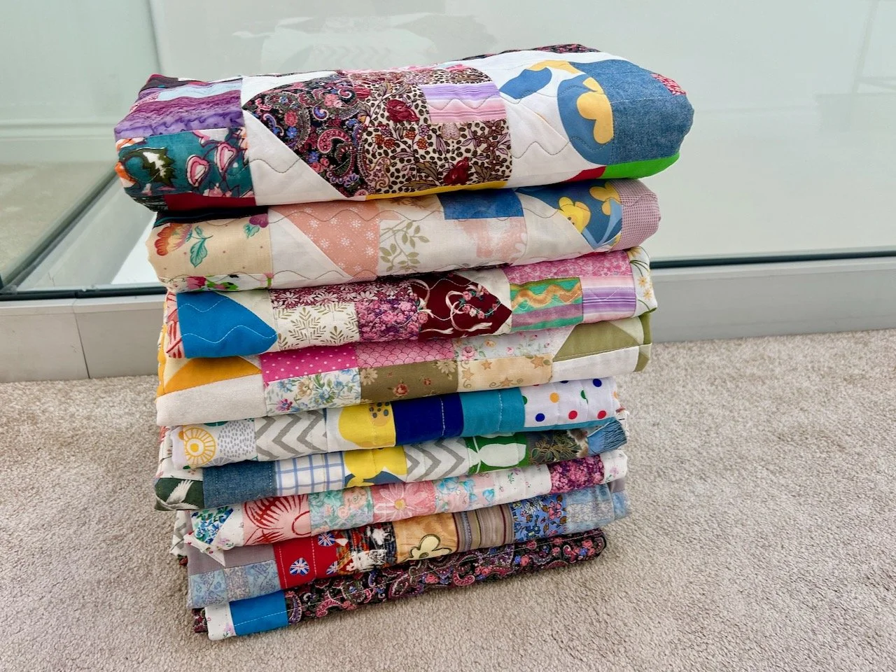
It’s been a while since I’ve shared some quilts from this year’s Newark Quilt Show, so today I’ve got some brightly coloured modern designs to share. The quilts here are all made by Mandy Munroe for a variety of modern quilting magazines over the past twelve years or so, and it was great to see them all together. Mandy says this is just a small selection of her quilts, and I’d love to see them all, but for now I’m happy just seeing, and sharing, these - I hope you enjoy them too.
, MANDY MUNROE
The show notes also said that it took Mandy a while to get used to designing quilts six months ahead of publication, so making winter quilts in summer and vice versa, but with access to top-secret fabric prints pre-release must have been thrilling, even if they couldn’t be shared widely, just yet.
I love the colours in the next two square based quilts, but I’m under no illusion to the amount of work in either of these. The Happy Squares quilt below brings ‘doodles in [Mandy’s] notebook were brought to life’ against the colourful squared backgrounds. I’m not sure my doodles could be a quilt, or even if they’d ever be this structured!
HAPPY SQUARES, MANDY MUNROE
CHEQUERBOARD, MANDY MUNROE
And what’s better than a chequerboard - well a chequerboard within a chequerboard of course! This quilt was made from scraps, and the smaller chequerboards meant that using every small scrap was possible.
BUCKLE UP, MANDY MUNROE
Mandy notes that for the Buckle Up quilt above she’d had the bold repeat pattern in her notebook for a while, and with this fabric she ‘went large!’ - I like it, and I like how the shapes make your eyes keep moving over the design.
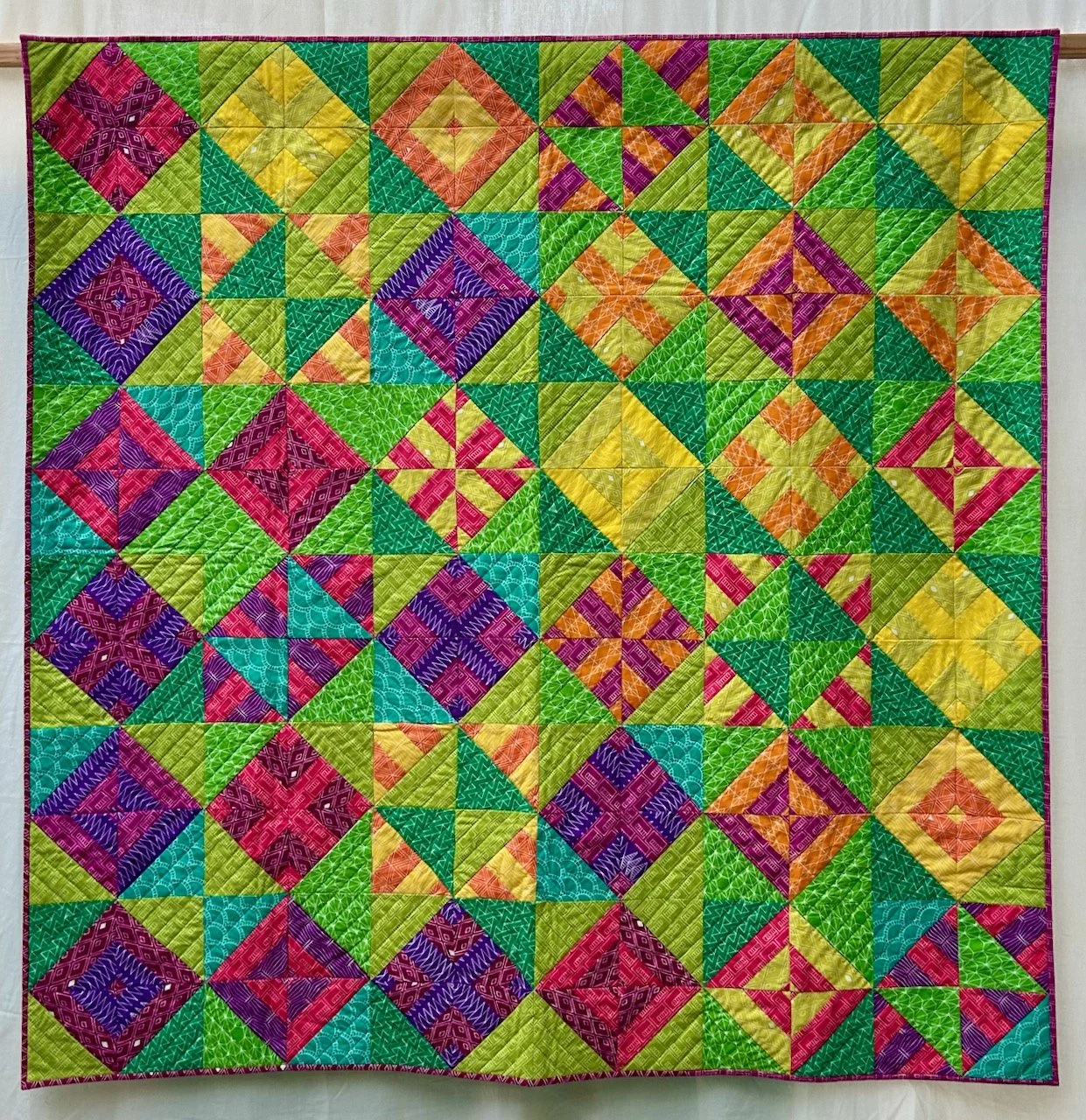
This next one appeals for the colours, and is an experimentation of different colour combinations pieced into square blocks, and I can see what Mandy means when she says the finished quilt looks like a summer garden with umbrellas (from above).
AL FRESCO SAMPLER, MANDY MUNROE
The brief for this quilt was colours of the Kasbah, and the design is based on a motif that Mandy saw everywhere in Marrakesh. It’s great isn’t it, and I love how the bright colours pop against the neutral background.
KASBAH STAR, MANDY MUNROE
Now this one is very clever, and uses a bundle of Dear Stella Intermix basics which clearly I now need to check out! The bold prints were used on the triangles and the paler prints used to create streaks across the sky - I’m definitely a little bit in love with this one.
INTERSTELLA, MANDY MUNROE
What also struck me though was not every quilt needed to be quite so detailed. These next two take repeating shapes and are no less impactful for it. The one below was for a ‘Monochromatic with a pop’ issue and Mandy kept the design minimalistic and graphic.
MONOCHROMATIC, MANDY MUNROE
STACK, MANDY MUNROE
The quilt above according to the show notes was ‘possibly inspired by containers loading at the docks’ - and now I can’t unsee that, it just goes to show that inspiration is everywhere if we take time to notice it.
WINDOWS AT KEW, MANDY MUNROE
This final quilt was inspired by the brickwork surrounding the windows at Kew Palace, and is based on a photo that Mandy took and then simplified. And if you let your imagination wander it’s perfectly possible to imagine the flowers reflected on the glass.
They’re all brilliant quilts, and I’d be hard pressed to choose a single favourite from them, but what about you - is there one that speaks, or sings to you?